
When you face difficult problems, finding their root cause is essential to solving them and preventing recurring issues. The Fishbone Diagram, also known as the Ishikawa Diagram or Cause-and-Effect Diagram, is a powerful tool for root cause analysis. This article breaks down what Fishbone Diagrams are, how they work to find root causes, and how to use them effectively to solve problems.
Root Cause Analysis Infographic

What is a Fishbone Diagram?
A Fishbone Diagram is a tool to help teams explore why a problem is happening. It facilitates categorizing, identifying, and digging into a specific issue’s potential reasons . Named for its resemblance to a fish skeleton, the diagram systematically organizes issues into branches, making it easier to pinpoint the different causal systems occuring and their roots.
The overall method is pretty straight forward: put the problem and goal in the head of the fish; use the umbrella categories to help generate potential reasons for the problem; then dig into each one trying to to find it’s underlying reasons, and the reasons for those reasons, and the reasons for those reasons, and so on. This analysis leads to looking wider for causes and using deeper thinking about their roots.
Often, the key to success is assembling a diverse, knowledgable team and a facilitator able to break through the status quo. The result is a clearer understanding of the problem and more targeted, effective, nip-it-in-the-bud solutions.
Key Features of a Fishbone Diagram:
The Head of the Fish (Problem and Goal Statement)

- The head of the fish represents the problem you’re trying to solve (the Current Condition of the system) and the goal (the Target Condition for the system).
- This is the focal point of the diagram and should be clearly defined to ensure everyone understands the issue being analyzed.
- A well-defined problem statement avoids ambiguity and sets the stage for effective root cause analysis.
Umbrella Categories

- “Umbrella” categories of the types of potential causes form the main “bones” branching off the fish’s spine.
- These categories serve as broad groupings to brainstorm causes systematically.
- Classic umbrella categories sets include the 6Ms and 4Ps:
- 6Ms (Manufacturing Based):
- Methods
- Materials
- Machines
- Manpower
- Mother Nature
- Measurements
- 4Ps (Broadly Applicable):
- People
- Place
- Policy
- Procedure
- 6Ms (Manufacturing Based):
Causes

- Sub-branches under each category detail specific causes contributing to the problem.
- Each sub-branch represents a potential reason why the issue exists. Teams can use techniques like brainstorming or interviews to populate these causes.
- Sub-causes can also be added as smaller branches to reflect deeper insights gained through methods like the “5 Whys.”
- Identifying actionable and specific causes is critical to finding effective solutions.
Why Use a Fishbone Diagram for Root Cause Analysis?
The Fishbone Diagram offers several benefits:
- Organized Analysis: It helps teams systematically explore and document all possible causes.
- Collaboration: Encourages group discussions, leveraging diverse perspectives.
- Clarity: Visualizing causes and effects makes complex problems easier to understand.
- Problem Solving: By targeting root causes, teams address the actual problem rather than its symptoms.
How to Create a Fishbone Diagram
Follow these steps to build an effective Fishbone Diagram:
Step 1: Define the Problem and Goal
In the “head” of the fish, state the problem you want to solve. The problem statement should be specific, contain a measurable metric, and use a neutral tone. Then, define the goal.
It can be helpful to start with a broad challenge statement, a vision of your moonshot, so to speak. Think, “What would it look like if we solved this problem completely,” and write down the situation you envision. Then convert this into a SMARTer (Specific, Measurable, Attainable, Relevant, and Time Bound) goal.
Use metrics to quantify both your problem and goal. For example, you might describe your problem as involving high defect rates of 20%, your challenge as eliminating defects in the production process, and your goal to reduce defects to less than 5% within six months.
Or, perhaps your issue is long 75-hour response times in an IT department. Your challenge could be to eliminate wait times before IT responds to inquiries and resolution to within a day. Your goal could then be to cut response times to under 24 hours within three months. This approach provides a clear direction and criteria for success.

Step 2: Identify the Umbrella Categories
Next, divide the fish into roughly four to eight “Umbrella Categories.” These are categories of issues that might be causing the problem. Aim to make roughly four to eight umbrella categories.
It can be useful to start with standard categories like the 6Ms (Man, Machine, Method, Material, Measurement, Mother Nature) or the 4Ps (People, Place, Policy, Procedure). Then, tailor, combine, or add to those categories to match your situation. For example, you could add the 2 Cs: Communication and Culture when appropriate. The goal is to create a set of categories likely to contain the reasons for your problem.
For instance, in our IT example above, we might start with the 4Ps, then add Hardware and Security as categories based on the belief they will help prompt us to find root causes for our response time issues.

Step 3: Brainstorm Causes
Here you will use the umbrella categories as prompts to brainstorm causes. For each category, ask if there are issues of the umbrella category type that are causing the problem in the head of the fish?”
For example, in the above IT response time problem, you could ask, “Are there issues with our procedures that are causing the long response time delays in IT?” Then, with your team, brainstorm the procedural reasons for the problem. You might not be able to identify reasons from each category; this is okay.
Add the reason as branches under their umbrella categories. The goal is to reach as broadly as possible and identify as many possible causes as you can think of.
Don’t worry about whether you’re in the correct umbrella category. It’s not important. Many issues are either a blend of categories or, as you dig deeper, have root causes that are a different category (for instance, the root cause of a procedural problem may be a policy issue). Plus, you can always go back and clean up the causes after you’ve brainstormed. The most important part in this phase is simply to identify as many potential causes as possible.

Step 4: Drill Down with the Five Whys
Now, drill down into each cause you’ve found, essentially asking why again and again at about five levels. For instance, in our IT example, perhaps you’ve identified that dealing with the same questions repeatedly and having to email back and forth to get relevant information were procedural issues that contributed to the delays in response times. You would ask, “What is causing this cause?” Perhaps the response is that “there is no standardized intake form and no FAQ page.” For each of these new causes you identify, you would then ask why and add these causes as smaller branches connected to the cause they are the cause of. Continue to do this until you cannot come up with more causes. Although this technique is called the “Five” Whys there is nothing special about the fifth why. The basic idea is to just keep digging.

Step 5: Analyze Potential Root Causes
Review the diagram to identify the most likely root causes. Use data, team input, or additional tools to validate your findings.
Two useful tools for analyzing potential root causes are Pareto Charts and Scatter Plots.
Pareto Chart
A Pareto Chart helps quantify and rank causes based on their frequency or impact. Based on the rule of the vital few or 80/20 rule—where most problems (often around 80%) stem from few causes (around 20%). By plotting the identified root causes from the Fishbone Diagram, or their corollaries, onto a Pareto Chart, and comparing them based on a relevant metric, teams can focus on causes that are responsible for the bulk of the problem.
For instance, if we were able to take the root causes in our fishbone diagram and utilize them to categorize the time spent by IT staff, we might be able to determine if there is a particular problem that is taking up the bulk of their time. Focusing on this problem will often offer more bang for the buck in terms of solving the underlying issue. A Pareto Chart for our IT process problem might look something like this.
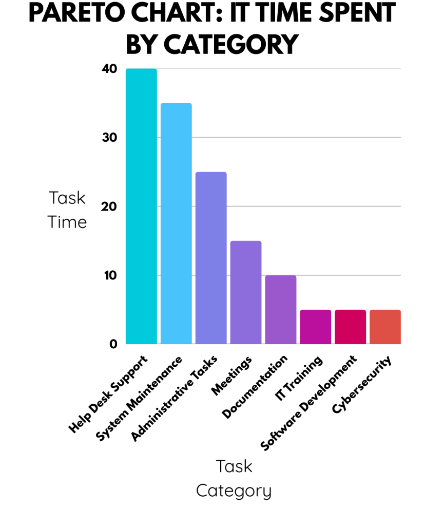
The above Pareto chart indicates that most of our team’s time is spent on tech support and system maintenance, and very little is spent on training, software development, and cybersecurity. This supports the theory that firefighting predominates and there is little time to develop system-wide, time-saving solutions. Based on this we may want to drill down even further and create a Pareto chart to identify the particular support, maintenance, and administrative tasks that take up the most time. Then, apply the fishbone diagram to these specific issues, targeting their reduction, and identifying their root causes.
Scatter Plot
Once possible causes are identified, teams need to determine whether there is a real relationship between a suspected cause and the problem—this is where a Scatter Plot becomes useful.
A Scatter Plot helps visualize the relationship between two variables by plotting data points on a graph. When used alongside a Fishbone Diagram:
- A suspected cause (e.g., machine speed, training hours, or temperature) is placed on the x-axis.
- The effect or problem outcome (e.g., defect rate, cycle time, or error frequency) is placed on the y-axis.
- The resulting pattern of points shows whether there is a correlation—strong, weak, or none—between the variables.
Here’s a possible Scatter Plot for our IT example indicating that for individual IT employees (they are represented by the dots on the graph) the number of days of work experience they have and the average time they take to resolve an IT request.

It seems to show a non-linear relationship with a hook shape where there is a reduction in time as people get acclimated but the most experienced folks often have IT requests that take them more time per request.
Here too you can drill down further to better explore the root cause. Reapply the five why’s. Ask why the amount of time reduces and then grow again based on worker experience. How could you test to determine what’s causing it? Is there data you could analyze that might reveal the reason?
By combining the root-cause brainstorming firepower of the Fishbone Diagram and Five Whys with the understanding of the causal connections through data and analysis methods such as Pareto charts and Scatter Plots, teams can use data-driven root cause analysis to more effectively solve their problems.
Step 6: Implement Solutions
Now that we have identified the likely root causes for our issues, we can utilize this information to create targeted solutions. Here are some tips for brainstorming solutions:
- Use the Fishbone Categories and Causes as Idea Prompts
- Go through the causes in each category and ask:
- “What’s a feasible way to control or eliminate this?”
- “What change would flip this from a weakness to a strength?”
- Go through the causes in each category and ask:
- Focus on the ‘Vital Few’
- Start with the top causes from the Pareto chart that are driving most of the problem.
- Brainstorm solutions for these first—don’t get distracted by the “trivial many.”
- Target Strongly Correlated Causes
- Use scatter diagrams to back up your focus—put more time into causes with a statistically strong relationship to the issue.
- Look for Leverage Points
- Identify where small changes could have a large impact, especially among highly correlated causes with multiple downstream effects.
Once you’ve identified solutions analyze them to determine the most impactful set of them and create a detailed action plan for implementing them.
Final Tips for an Effective Root Cause Analysis
Here are some final thoughts to keep in mind as you facilitate a root cause analysis with your team using the Fishbone Diagram:
- Involve the Right People: Include team members familiar with the problem. For instance, if you’re analyzing delays in patient discharge at a hospital, include nurses, doctors, and administrative staff who are directly involved in the process.
- Be Specific: Avoid vague causes. Drill down to actionable specifics. Instead of listing “communication” as a cause, specify “incomplete handoff between night and day shift nurses.”
- Validate Causes: Use data and observations to confirm potential causes. For example, if “machine downtime” is listed as a cause for production delays, review maintenance logs and downtime records to see if there’s a pattern.
- Iterate: The first draft might not capture all causes. Revisit and refine as needed. For instance, after your first fishbone diagram on customer complaints, you might realize you didn’t explore shipping delays. Go back and add insights from the logistics team.
- Keep Digging: Perhaps the key is to keep using what you’ve learned to dig and dig and dig some more. As Continuous Improvement pioneer Shigeo Shingo put it: “A relentless barrage of ‘whys’ is the best way to prepare your mind to pierce the clouded veil of thinking caused by the status quo.”
Whatever issues you are tackling, get to their root causes using the Fishbone Diagram and create sustainable solutions that actually work.